Series: Big Tech Alternatives
tl;dr: My experiences with the Vivaldi browser, offering some significant great ideas but also some rough edges.
As I noted briefly in a previous post, I was not feeling any particular need to switch my personal browser from Firefox to anything else, or my work browser from Edge to anything else. Then I saw a reference from Vivaldi on Mastodon to a really interesting new feature that to my knowledge no other browser has. I will get into that feature a bit more below, but that feature - and the coincidental timing of when I am already reevaluating a lot of my tech choices - gave me enough of a prompt to give it a try.
I initially wrote this after one workday of trying to use it and some experiments with it at home. I'm now giving it an update almost two months with more personal usage, and a version update to 7.9 later.
Getting Started
The first natural thing to do is try to import all your settings from a previous browser, to avoid having to repeat setting things up. There are options in Vivaldi to do that from Edge and from Chrome. Oddly, there's no way to import my data from Firefox, which is what had been my primary personal browser previously, so I'm out of luck there entirely.
Importing from Edge, which I tried on my work computer, is possible but with a bit of pain. It requires that Edge be closed. On Windows 11, Edge is never closed; it's always running in the background. To be able to import from it into Vivaldi, I needed to open Task Manager and end the task. There was no prompt to help you do this. I suppose the kind of people who are going to try Vivaldi are mostly the kind of people like me who would know how to do this, but it was a little strange.
Tab Management
Here's the feature that prompted me to try it after hearing about its addition to 7.8: tab tiling. At least in theory, this is an extremely useful and convenient way to view two pages at once. This was something I saw and immediately imagined I would use a lot, like having one page of the site I'm testing and the issue summary side by side. In my few attempts at using it, it works as advertised. It's easy to use. It's easy to discover by accident (even if you try to drag a tab out to make a new window, you might notice the indicators that you could drop it into this same window). I have no notes for improvement on that.
It does some other interesting things with tab management, not just the tiling.
It has vertical tabs, which are a necessity for me at this point. As of 7.8 it didn't conveniently expand and collapse, like it does on Edge or Firefox. Instead, it was one adjustable size at all times. I really like how Edge and Firefox keep the tabs out of the way when I don't need them, but then expands to be able to view them when I do scroll my mouse over there. This isn't a big deal on a wide enough monitor to still see all of the site anyway, but it just felt like another in my sentiment so far that Vivaldi has great ideas but is a little rough in implementation.
7.9 fixed this. Sort of. It doesn't automatically expand and collapse. Instead it automatically expands and hides entirely. This creates a few problems for me already:
- When hidden, I have no hint at all of what tabs are open, just my memory that I can find out again by scrolling to the left. I have already closed the entire window a few times forgetting that there were other tabs still there that I still wasn't done with. As somebody who approaches my tabs like a checklist, closing them once done, not seeing a collapsed version of that checklist makes it harder.
- I am more prone to scroll too far left and activate the tab bar by accident, because I'm not consciously thinking about them being there the way I am if they were visible but collapsed smaller. I'm just trying to scroll to the edge of the page for something.
The approach of Edge and Firefox is better, in my opinion, with a small amount of space still claimed at all times for the vertical tabs rather than completely removing them.
It also offers tab stacking, roughly equivalent to what at least Edge calls grouping. It's a way to minimize the space required for tabs, and making it more obvious which tabs go together, while still keeping them somewhat accessible. It has three options for how those stacks appear (on desktop):
This is the Compact view:

As the name suggests, this minimizes the space required. It is also the least obvious at a glance that there even are other tabs there. If you scroll over the little line above the stack name, you do get a preview of that tab to remind you what it is before clicking on it, which is a necessity.
This is the two-level view:
This is the other extreme, with needing a lot of space but making it really easy to tell which tabs are within the stack. Maybe if I had an ultrawide monitor I would like this more, but as is, it makes my challenges with the vertical tabs not auto-collapsing even more of a challenge.
Finally, this is the accordion view:
This is in the middle in terms of space consumed, and is overall my favourite. When collapsed, it takes up about the same amount of space as two tabs, but it is also much more obvious that it is a stack and what you need to do to look within it compared to the compact view, and doesn't require an extra column of space like the two-level view. It isn't as clean of a look as how Edge handles tab groups, but it's the same idea. I'll leave it on that setting.
The Workspaces concept takes the grouping of tabs to another level. This is a toggle at the top of the tab bar. You can create a new workspace with a completely different set of tabs. They stay saved and accessible, even when closing Vivaldi in between, just tucked away behind that toggle not taking up space and confusing you on which tabs are related to what you're doing right now. I'm not sure how much I'll really use this. In my previous job doing client based work, when I sometimes had to do a lot of flipping between multiple clients, getting sidelined from one to address something more urgent for another, this might have helped more to keep each project straight. I could have had one workspace for each client, only closing each bundle of tabs when I finished that client's task. There is some degree that it is still true now that I can be juggling multiple distinct tasks, but mostly I think those rise to the level of groups/stacks, not workspaces. It's a good idea, just maybe not for me.
Security and Privacy
In addition to tab management, security and privacy is the area that Vivaldi is most known for.
It's built on Chromium, but the fact that Chromium can no longer install full power ad blocker extensions doesn't hurt as much because Vivaldi has its own ad blocking built in. That ad blocking is not as reliable as what I was used to in Firefox, though. Rarely, Vivaldi has failed to block ads and it was jarring how terrible of an experience that is when you're used to not seeing them. Much more often, I get the annoying popups telling me to disable ad blocking every time I visit a site, which Firefox mostly kept out of the way for me. My general philosophy is that I don't mind seeing those once per site, as in some cases I actually do want to make an exception if they are using context ads instead of surveillance ads (I know of one site where that is the case). But if I get those every time I visit a site where my only other option is surveillance ads, it just makes me want to stop visiting that site. So, Vivaldi's ad blocking is a lot better than nothing, but not as good as I was used to.
Proton VPN is built-in as well. You're only a click away from one of the best VPN solutions, even if you don't have a paid Proton account. For free, it will automatically connect you to the fastest available server, and Canada is one of those limited options. As long as I just want security and not to choose where specifically to spoof that I am accessing from, the free version is fine.
Other UI
Vivaldi is loaded with customization options, not just the ones about tab management and security I already covered. This is the power user browser. I'm not sure any of these are truly revolutionary, but it is still nice to see so much freedom to make it your own.
There were a few defaults I did not like but I did find settings to change them which I haven't already mentioned:
One was the progress bar on the tab when refreshing or loading a new page. When on that tab, I couldn't see the progress bar at all, so I couldn't tell that it was still trying to refresh. That means when I was debugging an error, I couldn't tell if the error was still there or if the page just hadn't refreshed yet. Sometimes when working with locally-hosted Docker container sites, it isn't obvious if it is just being slow or not. I found a setting that shows a circular indicator in place of the favicon in the tabs bar and like that better. This one I kind of think is a weird choice for the default.
Most of the other issues I had really stood out as I got into development work.
Development Challenges
I am more generous toward Vivaldi as a general power user browser than I became as soon as I tried to do some web development work in it.
One default I didn't like was hiding the parameters in the URL of the address bar. This made it more annoying to debug something that involved the parameters. I found a setting to change that as well. I get why most people doing most casual browsing don't need to see those parameters and this is an entirely reasonable default, but when I'm developing, I do sometimes need them.
Speaking of developing, the Inspect Element is hidden under an extra layer of menu labelled "Developer Tools." That's obvious enough, but it means every time I want to inspect an element, which is a lot, I have that extra layer to navigate. That doesn't have an obvious setting for it, but buried under Appearance are options to customize what appears in what menu. There are a lot of those menus, with one for every possible context of the page (selection, image, media, link, etc) so the change needs to be made on all of them or it will be annoyingly inconsistent. I was able from there to move the developer tools up a level. It's a little clunky, but again this does make some sense as a default: the people that don't want developer tools want them somewhat hidden under an extra layer, and the people that do will figure out how to change the setting even if it isn't that obvious.
Here's another one: by default using Tab to move between elements only goes to forms, not to all control objects. I have no idea what the rationale is for this but it would be completely unusable for somebody requiring navigating by keyboard instead of mouse. There is a setting to change it, but I definitely think this one has the default wrong. The default should be the most accessible, and if somebody wants something more limited, fine, let them change it rather than confusing every keyboard user first. I think this is also true of Safari and it annoyed me when I discovered it there, too.
Bookmarks
Bookmarks gave me a lot of trouble at first. Since there is no tool to import everything from Firefox, I tried to import at least my bookmarks. I went to Firefox and exported as HTML. Then I went back to Vivaldi, found an Import tool which allowed from HTML, and used that. The Vivaldi interface said it imported, but no bookmarks showed up. Then I gave up and tried to add a bookmark manually from within the bookmark window, and that didn't work either. I clicked on the button to add bookmark from the address bar and it didn't do anything. I click on the + button within the bookmarks window and it didn't do anything. Then it got even stranger: I checked it on mobile, after trying on desktop multiple times, and saw multiple copies of imported bookmarks. They somehow got imported and synced, but they don't even show up on the device that I imported them on.
I tried importing again a few days later. It worked instantly this time. Maybe I got a bug fix update, or maybe something else weird was going on that I can't explain.
Another minor bookmarks nuisance is that it is tied to the right sidebar. I don't really want anything else from the right sidebar. Nicely, I could move the button to open bookmarks into other toolbars - that's great. When I click on it, though, it opens the bookmarks section and the rest of the right sidebar. Then when I close the bookmarks, it doesn't close the sidebar again. It's a minor nuisance, and I don't rely on bookmarks so much that it will really add up, but it's another in the "rough around the edges" category. Arguably this got a little better with the 7.9 update and turning on auto-hide for the right panel, but that has the same problem as doing that with the tab bar that I forget it is there and accidentally open it a lot more than I want to. It still feels a little off sometimes.
Email, Calendar, and Feeds
I have to note that Vivaldi also includes an email client. This is IMAP only, so if like me you are currently using an Outlook.com account and/or a Proton account, IMAP is a step down compared to ActiveSync in desktop Outlook and the Proton app functionality respectively. It also includes a calendar app. Because these are only IMAP, I did not bother trying it. I don't think there's any real scenario that I will use it.
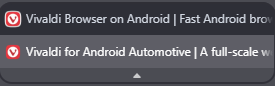
Vivaldi also includes feeds. Like the bookmarks, I had issues with this at first. There was a button for "Feeds" in the Toolbar Editor but it refused to add it to any of the toolbar areas, so I had no idea what that is supposed to go to. What did clearly work was a notification when there is a new post on a feed. That's maybe sometimes useful for certain feeds that I really need to know about right away, but for the most part not what I'm looking for. I hoped it had a desktop equivalent to what I do with Start Launcher on Android, having my own customized news page that I can browse, and I just can't figure out how to open it. Like the bookmarks, this also started working a few days later. There is a button in the toolbar, which opens a sidebar to browse all your feeds. So it is there after all.
Now that it is functional, I do not find this interface to be the most intuitive. I still have not figured out what the two different numbers are beside each feed. One must be "unread" as that goes down when I read an article, but I don't know what the other one is doing there, mostly confusing me into thinking there are more articles waiting for me than there really are.
Also significant is that these feeds aren't there on mobile at all, so I currently have no way to know what I've read already on a different device. This is a major disadvantage compared to using something like Feedly. Currently I am mostly trying to remember to check the Feeds in Smart Launcher on my phone, which I really like the interface of, but it also doesn't do anything to remember what I've already read and doesn't sync to my computer at all. That means sometimes I'll never see an article and other times I'll see it several times before it gets buried. I feel like there has to be something that offers a nice interface and syncing read status between devices, but it would probably cost money. I hoped Vivaldi would be able to help with that, but it falls short on both fronts.
Mobile
Vivaldi also has a mobile app with sync between installations if you login. I've had less rough edges here.
My biggest UI rough edge is that there's some weird duplication. When clicking on the button in the bottom left, I see Bookmarks, History, Notes, Downloads, and Translate. There is another longer menu that opens from the button on the bottom right. Among other things, that includes... Bookmarks, History, Notes, Downloads, Translate. I'd be happy to get rid of the one in the bottom left, because I really do not know what it is solving that isn't already solved by the full menu, but I did not find a way to do that.
Tab stacking on mobile is really nice to have, though, as there are a few long term groups of sites I like to keep tabs for on mobile, but if they were all showing up at the top level equally, that would eat up a lot of space. I was mildly critical of the UI for the tab stacking on desktop, but I love it on mobile.
Conclusion
My sentiment so far largely comes down to what I've said throughout this post: there are a lot of good ideas, some of which I benefit from, but there are a lot of rough edges, too.
Personal Use on Desktop: vs Firefox
Firefox has better ad blocking once an extension is installed, but it isn't there by default. It also has the better approach for the collapsing vertical tabs. Vivaldi has Proton VPN built in, but it isn't that hard to add that to the computer or to Firefox as an extension instead. It also has tab tiling.
So in terms of privacy tools and tab management, it's mostly the better vertical tabs of Firefox vs the tab tiling of Vivaldi.
The argument might really just be over which company's mission and structure I like better. Firefox has been around longer, and it's important that they offer the rare non-Chromium browser option. They're based in the US. The Mozilla corporation describes itself as:
a non-profit organization that promotes openness, innovation and participation on the Internet
Vivaldi is Norwegian, smaller and with less of a history. They describe their two ground rules for the browser as:
privacy is a default, and everything's an option
They are both good missions. Vivaldi's is a little more precise in its guiding principles but which of those approaches is better is debatable. Firefox maybe gets a bit of an edge for not being Chromium and for a longer track record as being the most viable not Big Tech alternative. Vivaldi gets a bit of an edge for really pushing the limits on innovation and more privacy by default, as well as being EU based instead of US based.
Since it is close enough, for now I'm going to keep giving Vivaldi a longer try, but I do think there's a reasonable chance I end up back on Firefox if the vertical tabs continue to annoy me this much.
Work Use: vs Edge
At work has different calculus. It's true that's where the tab tiling and other management tools would be more useful, since that is generally when I am juggling a lot of tabs.
But I also have a work Microsoft 365 account, on a managed Windows Enterprise device. There are some advantages in ease of use to tie everything to that one managed account.
A lot of those little rough edges I've named would also matter more in a work context doing something repeatedly and often in a hurry. Those might add up to more lost time than is saved by the tab tiling.
I'm always going to be a bit more conservative about changes I make at work, where the impacts are higher, so I think I'll stick with Edge there for now. But if I am trying Vivaldi more at home, then I will be more aware of those couple rough edges do get smoothed out in such a way that using it at work would make more sense. That leaves the door open that it could also become my work browser, just not yet.
Personal Use on Mobile
So far I feel a lot more comfortable continuing with Vivaldi on mobile. Maybe that's just because I don't need to do as many very specific things on it. I really like its tab stacking. I don't like its ad blocking being a bit worse than Firefox's, but that's not quite enough at this point to consider switching back.
Previous: Decisions Overview
Next: Git Providers