Series: Movie Directory
tl;dr: The view and edit screens in a movie directory Power App.
This continues a short series about a movie directory personal project exploring Power Apps and Dataverse. In the first two posts, I’ve laid out the data structure in Dataverse and the gallery and filters screens in the Power App. This post will tackle viewing and editing a single movie record in the app.
View Screen
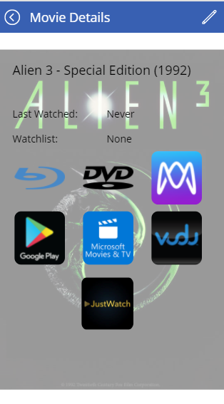
The view screen started out as a pretty bland list of fields, but rapidly evolved into something more attractive and more functional:

The text fields are straightforward. The icons are a bit more complicated. There is one data field with choices for all the different platforms that we own a movie, but I wanted to show it differently, with one icon for everywhere we owned it while hiding the icons for platforms we don’t own it.
There are six icons for ownership plus a JustWatch link. I grouped the six into two rows, putting Blu-ray, DVD, and Movies Anywhere on one line and Google Play, Microsoft, and Vudu on the next. Whether each icon is visible or not is determined by this value in the Visible field:
If([@Owned].'Blu-ray' in BrowseGallery1.Selected.Owned, true, false)Making that more complicated, though, is that it looks awkward if you have the third icon in a row without the first two, e.g. Movies Anywhere without Blu-ray or DVD. To solve this, I dynamically set the width of the icon to 0 if we don’t own in that format, then set the X value for placement of the next icon in the row to be a certain distance after the width of the previous one.
Here’s the formula for the width of the Blu-ray icon:
If([@Owned].'Blu-ray' in BrowseGallery1.Selected.Owned,142,0)DVD then gets this for an X value:
If(BlurayLogo.Visible,50 + BlurayLogo.X + BlurayLogo.Width,BlurayLogo.X + BlurayLogo.Width)And finally the X value on the Movies Anywhere button:
If(DVDLogo.Visible,50 + DVDLogo.X + DVDLogo.Width,DVDLogo.X + DVDLogo.Width)This does not handle dynamic placement on the Y axis. It can still be a little weird to look at to have one icon on the top row and then all three icons on the second row. Hypothetically a similar approach would work with some more complicated formulas to improve that, but I left it at this point.
The other unique part of this view that adds a lot to the attractiveness of it is the cover image taking up the background. This is a straightforward image component stretched across the background, with this value for Image:
BrowseGallery1.Selected.Cover.Fulland a Transparency of 0.6, to make sure the text above it is still readable.
Edit Screen

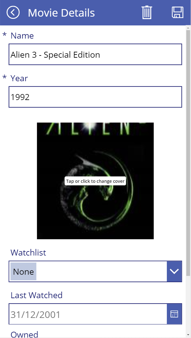
The layout of the edit screen is quite a bit simpler. The fields are standard editable fields tied to the Dataverse column.
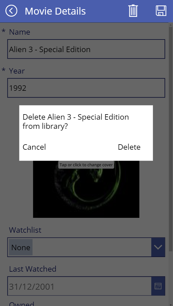
I did add one more complicated piece, though. I was worried about having the delete icon so close to the save button, despite that being the default placement within Power Apps. So, I built a confirmation dialogue.

The OnSelect value for the delete button is this:
UpdateContext({showPopup:true})This initiates a change that displays a rectangle in the middle of the screen which has the Visible property set to:
showPopupThere is also another larger rectangle that is solely to darken the movie screen behind it, to increase focus on the delete dialogue. This rectangle has a Fill property of:
RGBA(0, 0, 0, 0.6)and the same Visible property as the other delete dialogue boxes, showPopup.
Clicking on the Cancel button will reverse the action of the initial Delete press and take you back to editing the movie, thanks to this OnSelect property:
UpdateContext({showPopup:false})Pressing the Delete text will confirm the deletion, removing the movie and redirecting the user back to the gallery, with this OnSelect property:
Remove(Movies,BrowseGallery1.Selected);
UpdateContext({showPopup:false});
Navigate(AllMovies)
What’s Left
At this point, I have a data structure and a fully functioning app. What I haven’t covered yet is how to most efficiently load in 300+ movies. A final post in this series will look at that problem, through a Power Automate Flow that I wrote to import all the movie information from our previous system and help collect cover images for all these movies quickly.