tl;dr: Fluid UI, available as a Drupal module, can help with site accessibility.
In doing research on accessibility tools that could be incorporated into a Drupal site, a co-worker recommended Fluid UI. This is not the same Fluid Framework used by Microsoft as the backbone of the new Microsoft Loop tool, or the Fluent UI Microsoft design language. There’s lots of use of Fluid and Fluent out there.
This one is an open source group out of Toronto focused on web accessibility, and they offer their tools in a few different formats. One is as a convenient Drupal module. I installed it on a dev site and took a look at what it offered.
The toolbar
It creates a toolbar across the top of the site, hidden by default behind a “+ Show Preferences” button. When expanded, there are a few options which can be valuable accessibility improvements.

- Change font size or spacing between lines
- Change to a high-contrast colour palette
- Emphasize links and buttons
- Display a table of contents
The only one I don’t quite understand the value of is the table of contents. It gives a bland unstyled list of links, programmatically generated based on the headers on the page. I’m not sure who this is for. Sighted users can see the headers. Blind or low-vision users can navigate in a screen reader by the header levels already, much more useful than a table of contents at the top. I assume there is a use case because these developers know a lot more about accessibility than I do, but I have failed to think of what it is. Feel free to comment if you know.
It’s also a bit odd visually, needing to scroll sideways to see all the options. I’d like to think there would be a better way to display them all.
Configuration
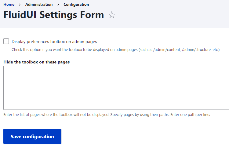
It has limited admin configuration options both around what pages the toolbox should appear on:

- Display on admin pages (yes/no checkbox). By default this is off, meaning it only shows on the public pages, but if you’re aiming to improve accessibility of administration as well, you’ll want to turn this on.
- Hide the toolbox on these pages (text area to specify pages). There might be some unique pages where it doesn’t work very well, so you can name those as exceptions.
I am a little tempted to come up with a basic settings page that can turn on or off each component, instead of it being an all-or-nothing, and maybe be able to change the order of the components, then offer that back to the developers. It’s not a big need, though; most are going to be happy with leaving everything on.
Conclusion
Overall, it’s a good tool. It is a little rough, so I do hope they smooth it out some more, but it’s certainly much better than not offering these accessibility improvements at all.
Previous: GitLab DevOps: GitLab Runner